George Baldwin @ falmouth
Thursday, 19 May 2011
Tuesday, 17 May 2011
small realization
while talking to other students about there work today I've found out that there is 2 pieces in the same room that make sound. so unintentionally my work will react with theirs which is pretty cool. it also made me realize that my work being reactive it is adaptive it can fit into a situation where sound is present where the other 2 pieces may battle for recognition mine can step back react and hopefully benefit from them.
Monday, 16 May 2011
Sunday, 15 May 2011
Saturday, 14 May 2011
point hand test
this sketch of the hand was inspired by Buhm Hong by just drawing the points there is lines created by us mentally joining the dots. i don't think it has the apparel of the layered hand but it works a lot faster so possibly have to figure out how to make it look like something i want to show.
I've added a colour changer when sound reacts as well as the points moving this ends up in a visually interesting effect. the movement of the pixels has a strong resemblance of things blowing in the wind with points over lapping other ones and swirling.
looking at this piece with my concept in mind of freedom under constrictions i think this hand shows a great sense of freedom as an image but it will always go back to the shape of the hand (when sound stops) and there for i quite like it. there are constrictions to the viewer but they are the one that lets the points float and move. i guess ive just striped it down to the motion in the piece it has lost its depth and complexity something i without i am not happy with.
Friday, 13 May 2011
word and execl
I've managed to get all the code into processing in just over 3 hours which is better than 3 days wooo. the answer was shifting the code into tables and then back to text in word. so for example i told word to convert the text into a table making columns at the spaces so then this enabled me to separate the 3 points that made triangles. then select those columns and convert back to text then split at commas this split between the x and y points. back to text then finally split at decimal points this gave me the columns of x full number coordinates i need for int() finaly adding another column onto the end and converting back to text with commas at the columns the empty one at the end put commas on the last digits.
the good news is that the hand works ! ... but the bad news is that its incredibly slow i need to try and find ways to speed it up currently I've tried all the triangle classes (TRIANGLES) (TRIANGLE_STRIP) and (TRIANGLE_FAN) the fastest is triangles so I'm going to keep with that. putting no shape class in makes it work faster when there is noFill() but with fill() it is even slower than drawing with triangles. if possible i don't want to change the complexity of the drawing something i could try is making the perspective point a different vector this means the sound doesn't move those points and it should take a 3rd of the points out because x and y stay in the same place.
...
ive put the perspective x and y coordinates in the code looks like this
 int xB = 1490;
int yB = 317;
thats before the setup()
then i draw it by putting this into the beginshape(triangles)
for (int i =0 ; i < (y.length); i+=1) {
vertex(x[i], y[i]);
vertex(xB,yB);
the computer runs through the array looping between the vertexs until y.length (or the amount of points y has) this joins every point to xB and yB ... but my theory of making it work faster was wrong im not sure why possibly because it has to make a triangle shape then fill it out of 2 vertex rather than 1 ... but im pretty much baffled and out of my depth with this one.
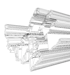
as well as making it slower it also joined the empty gaps between the fingers (image) this has messed up the layering and it dosent work but possibly potential to make it look like a continues line drawing if i take the xB and yB out.
the good news is that the hand works ! ... but the bad news is that its incredibly slow i need to try and find ways to speed it up currently I've tried all the triangle classes (TRIANGLES) (TRIANGLE_STRIP) and (TRIANGLE_FAN) the fastest is triangles so I'm going to keep with that. putting no shape class in makes it work faster when there is noFill() but with fill() it is even slower than drawing with triangles. if possible i don't want to change the complexity of the drawing something i could try is making the perspective point a different vector this means the sound doesn't move those points and it should take a 3rd of the points out because x and y stay in the same place.
...
ive put the perspective x and y coordinates in the code looks like this
 int xB = 1490;
int yB = 317;
thats before the setup()
then i draw it by putting this into the beginshape(triangles)
for (int i =0 ; i < (y.length); i+=1) {
vertex(x[i], y[i]);
vertex(xB,yB);
the computer runs through the array looping between the vertexs until y.length (or the amount of points y has) this joins every point to xB and yB ... but my theory of making it work faster was wrong im not sure why possibly because it has to make a triangle shape then fill it out of 2 vertex rather than 1 ... but im pretty much baffled and out of my depth with this one.
as well as making it slower it also joined the empty gaps between the fingers (image) this has messed up the layering and it dosent work but possibly potential to make it look like a continues line drawing if i take the xB and yB out.
Buhm Hong (research)
in the stuggle to find new ways to make my piece perfom faster i rememberd this artest from a gallery i had visited in berlin ,Buhm Hong.
his work like mine is bold black on white but instead of lines he uses dots. these dots make up the forms from patterns and links created by the constellations of different size dots. the exhibition i saw had one of these pieces in the window so when inside the light shone through and created this capturing glow resembling something like stars.
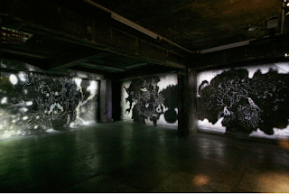
to me these woods of black containing stars are enviroments to explore and gaze just like when you look up to the stars you can feel a sense of scale that powerfull scary feeling of how small we really are. in the Weston society it is common to have a drive to make a differece to leave a mark for when we die but the scale of the universe hits me with realistion that it wont matter a thought that gives me a strange feeling with content.
i think I'm going to see what my digital hand looks like as a star or dot formation and see if it works faster hopefully pulling that resemblance of stars within the piece.
Thursday, 12 May 2011
Construction
construction of the hand in illustrator i just want to show the depth and layering of each section i personally find it nice to beadle to see behind the the visible.
the layering of the triangles turned out to be more complicated than i first thought. i have to take in to account what happens when each one of these triangles will move so the dont just need to fit in the section there are in but also when they overlap other sections do they cut through. this needs to be all relative if there a massive sections or one triangle that out layers the wrong ones around it when it moves it could look rubbish. this became esspecially hard to judge when the lines would be at a certain angle that made them have to go behind the one underneath when in a 3-d form it wouldnt work.
i now need to find a way to take the code into proccessing without painstakingly selecting each point and putting commas between pages of numbers.
this hand has 32 pages of points 8 more than the falling man this amount of points moving to I've sound is probably going to work too slow but i will just have to hope ... but this could fall flat on its face
Sunday, 8 May 2011
Sebastian Neitsch (research)
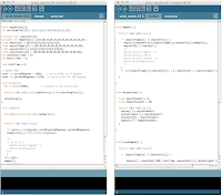
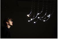
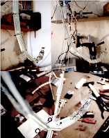 Sebastian Neitsch is a new digital artest and he really shows some pertential for the mediem the images to the right are of one of his resent projects where mechanical arms from the roof glow and follow around. this really shows the diverserty of proccessing although im making 2d animated imagery as long as somthing is electrical i could pertentoly translate it into sculpture and i think that is where i want to head in the futre but first i need to build the strong building blocks to the moveinto 3-d. on the foundation course i have found that for me to really be happy with my work i like to see it move. movment in art work especially reactive really caqptures me and i feel this piece is harnessing that by getting your attendtion then locking onto you. the sculpture is reflecting your intreast in it right back at you. a comincation between man and mechine looks to the future and asks how equal are we as we become more inderpendant on computers and mechines are we becoming more like them. my recent drawings have been like how a computer draws ... but does a computer everdraw there is always a person behind it creating that drawing but the style of the tools are what people look at when deciding wether its made ona computer or not.
he has also created this sound reactive room by mapping patterns onto the wall with a projecter they move , shake 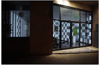 and destort to the sound recorded in through a drop down micriphone. this is exactly how i intend to make my sound reactive piece using live sound from the gallery space to produce movment and excitment in the imagery. the patterns hes chosen is unlike mine. he has taken what could be a wall design and made it surprise people by shifting colour and shape. mine is a piece of art (i think) when reacting or not.
 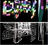 projection mapping as well as the sound reactiveness intreaguse me becuase of the entirety of the walls are covered in his imagery the light changes the space of the room as well bring an entire new dimension to the work and i imagen could be quite hypnotisiong to witness .
 and destort to the sound recorded in through a drop down micriphone. this is exactly how i intend to make my sound reactive piece using live sound from the gallery space to produce movment and excitment in the imagery. the patterns hes chosen is unlike mine. he has taken what could be a wall design and made it surprise people by shifting colour and shape. mine is a piece of art (i think) when reacting or not.
  projection mapping as well as the sound reactiveness intreaguse me becuase of the entirety of the walls are covered in his imagery the light changes the space of the room as well bring an entire new dimension to the work and i imagen could be quite hypnotisiong to witness .
Sunday, 1 May 2011
extracting from illistrator
exporting.svg files from illustrator i am able to use the drawings in my code but i need access to each individual point so it can move with sound. so i have opened the .svg file in text edit so i can see the code and find the points that make up the form.
Im going to try and make the falling man image sound reactive. i can use a data array to plot the points one array for x axis and one for y axis. then i should be able to add "in.left.get(i)*200" to the x and y with stored points. so it should be elegantly written somthing like this:
"triangle (x[i]+in.left.get*200,y[i]+in.right.get*200);"
I've also figured out that the middle number of the array should be the amount of points but instead of counting everything i can write it like (x.length) this tells the computer the amount of points in x is the number i want there.
getting the points that make up the drawing from the .svg file as become more time consuming than i first anticipated becuase the code is written differently from the proccessing i can not simply copy and paste it in. instead i need to command+doubleclick every point on the x axis in order and then repeat for y axis. becuase the buffersize is int i have to make x and y int this means i cant use decimal points, there probably is a way but i am running out of time so this is a small example of what should be happening.
.svg
int[] x = { 1020,1138,1132,1020,1138,1132,1013,1138,1132 };
int[] y = {352,313,378,352,313,378,354,313,378};
ive also had to reverse the points because i think processing layers it in the opposite way. this seems ok but i have 25 pages of plotting points to go through this could get boring to say the least.
Im going to try and make the falling man image sound reactive. i can use a data array to plot the points one array for x axis and one for y axis. then i should be able to add "in.left.get(i)*200" to the x and y with stored points. so it should be elegantly written somthing like this:
"triangle (x[i]+in.left.get*200,y[i]+in.right.get*200);"
I've also figured out that the middle number of the array should be the amount of points but instead of counting everything i can write it like (x.length) this tells the computer the amount of points in x is the number i want there.
getting the points that make up the drawing from the .svg file as become more time consuming than i first anticipated becuase the code is written differently from the proccessing i can not simply copy and paste it in. instead i need to command+doubleclick every point on the x axis in order and then repeat for y axis. becuase the buffersize is int i have to make x and y int this means i cant use decimal points, there probably is a way but i am running out of time so this is a small example of what should be happening.
.svg
polygon
fill="#FFFFFF" stroke="#231F20"
points="1132.655,378.347 1138.701,313.936 1013.674,354.385 "/
polygon
fill="#FFFFFF" stroke="#231F20" points="1132.655,378.347
1138.701,313.936 1020.624,352.925 "/
polygon
fill="#FFFFFF" stroke="#231F20"
points="1132.655,378.347 1138.701,313.936 1020.624,352.925 "/
int[] x = { 1020,1138,1132,1020,1138,1132,1013,1138,1132 };
int[] y = {352,313,378,352,313,378,354,313,378};
ive also had to reverse the points because i think processing layers it in the opposite way. this seems ok but i have 25 pages of plotting points to go through this could get boring to say the least.
Saturday, 30 April 2011
angled perspective
taking inluence form chin i decided to revisit my hand form and take his blue cones but destort them. i found that trying to destort the perspective lines like it would do in 3-d hard to comprehend and in certain parts (thumb) the pattern has gone wrong as i got the layering wrong. this mistake has opened up a new sort of negetive imagery that i quite like. notice how the thum is being echoed within the lines buy translating them to a new possition.
this drawing was alot to do with the procdcess and not knowing what i am going to end up with. i like this becuase i have to make conferdent decisions and stick with them throughout the piece. for example i didnt know i wanted to shift the perspective points for different sections of the hand but by letting my self explore this i have found a new pattern and and new proccess.
i also have had an idea to turn this into a website design. because of the coners in the perspectiv lines and the different angles it give the oppurtunity when moved to create planes if i spread a section out i could have enough space to create a gallery space on the hands. it would work like a drop down menu but for each perspective panal made by the lines like a file. i dont have the know how of how to make this just now but would like to try and make it over the summer and documenting these ideas is key to evolving as an artest.
Friday, 29 April 2011
Tofer chin (research)
tofer chin talks about being an artests is as much as being a good buisness man than it is to be creative. his work like mine contains alot of graphic design qualitys. i like how he creats depth within his images making the seperation between the cones and the flowing lines as strong as can be. this image reminds me of stalignites in a cave there dauting pressence above our heads. having the cones facing downwards i think gives power to them over this flowing pattern where as if they were at the base it would be a much more passive image. there is a relationship between the cones and the flowing pattern the curves tened to go around the height of the cones this creasing also adds power the the cones becuase they are pushing down on the lines. the destortoin of the lines then creates a new form underneath much like when i tryed to create fomrs with finger prints the same priciple of curviture depthe applys.
chin as well as painting spreads his work into different mediems and creates large enviroments of his illusionistic landscapes put the viewer directly into his pictures. this bouncing between media i think rusults in a more certified peice of work. taking the best factors from each mediem or even just using the same proccesses can create new and exciting creative imagery for ideas to be put across.
chin as well as painting spreads his work into different mediems and creates large enviroments of his illusionistic landscapes put the viewer directly into his pictures. this bouncing between media i think rusults in a more certified peice of work. taking the best factors from each mediem or even just using the same proccesses can create new and exciting creative imagery for ideas to be put across.
Thursday, 28 April 2011
Wednesday, 27 April 2011
its wroking (ish)
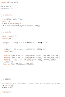
 it is reacting to sound and the triangles are moving how i want them to. but there are some major problems i can only create them in straight lines using the array i have and for some reason only up and left although that is how it looks but actually I'm drawing the triangles on the bottom layer first then telling them to build inwards. This requires working out how much the array will go across and adding from the center triangle. This way of layering is my biggest worry if i am to start trying to build the organic forms with these triangles. The way it is layered between the shapes is completely successful and it
seems it runs through the entire array code until it reaches the limit
defined this looping creates that layering because it only draws one
triangle at a time.
 next i am going to try and find a way of curving the line they are drawn on.
Tuesday, 26 April 2011
getLineIn()
 the best way to make a sound reactive piece ive found is using the minim class in processing and the get.Linein(). i can use the buffer size ( that ranges in this case 0-512) to create the movement i need in theory. this is the example proccessing gives today i need to work out how it works so i can manipulate it to draw sound reactive triangles.
 ive managed to get a line of triangles working by drawing a triangle and replacing the first 2 points with "i and i+in.get.left(i)*200" by making the points i this calls the array that draws from 50 to the buffersize (512) in intervals of 5. i think the layering may affect my control but i will have to do more experiments. there is a couple of errors that keep coming up about the buffersize in the array that i am going over or under i guess because the sound comes in wave there is both negative and positive numbers coming in.
but for the first day i think it is looking promising and should be possible (hopefully)
Monday, 25 April 2011
proccess
I've always followed a form of some kind when drawing the finger prints and wanted to see what happened if i just did it as i went along. be driven by the process of the lines and subject to error.
starting with the print i then chose to draw a line to one perspective point but stop at 5cm and the shifted to another perspective point 4cm and the switch to the final. what ended up happening because i was doing it stage by stage i was loosing track of certain points and there for having less and less to draw to the next perspective point a thinning began to appear dew to the layering of the lines. i find this very interesting because it is following a visual pattern rather than a structural and is not bound to the principles of 3-d but still has the illusion. the structure look mechanical like wires going into an engine or veins going into the skin branching out to reach every point. i really want to make a full body version of this taking the vain idea further possibly not worrying about body parts being joined but the veins link them up. its an exciting form of abstraction and merge of mechanic and organic influences.
the movement within the drawing i think is focused on the creation from the perspective point because of the build up i can see it animating easily into the finger print and back again following the lines. i need to start to try and create movement with my drawing this week and the plan is to use the volume of live recorded sound to move points along the x and y axis so the higher the volume the more the movement theoretically it should be possible but i will see.
Friday, 22 April 2011
Wednesday, 20 April 2011
Robert Hodgin (research)
robert hodgin created the itunes visulizer metosphere somthing that inspired me in to making a sound reactive piece in the first place.
robert hodgins work often collaberates with music he builds sound reactive or manually controled enviroments that he dysplays to add a visual sense to the music.
robert hodgins work often collaberates with music he builds sound reactive or manually controled enviroments that he dysplays to add a visual sense to the music.
Into the Trees (the piece to the right) was made to accompany i violinest and was dysplayed in a makeshift rusted olf drive in cinima. the piece created is manually controld by hodgin live so by pressing 3 he can tooggle trees to grow or not by press space bar a shockwaqve is sent through the landscape. this live control makes for a more varied and controled piece and suits live events for me to put my work into a gallery space i need my code to be able to react live to the sound.
the idea of the piece is to follow a path into an ever evolving landscape that changes to the mood of the music. it's buety is quickly noticed as it starts with sun rays shining through the trees.
aphex twin a conish electronic music artest is renound for his intense and sensual overloading gigs. hodgins visual have a massive part to play in this hectic but fun expirence. as an artest i need to find a way of making money with my work and live events like this would be ,i think, an amazing way. now im just excited to get started.
colour testing
by taking photos of my drawings i can take them into photoshop and start editing them how i would with a photo. the aim was to create a cell like feel so the background was fluid and parts of the form have been blurred to boost the illusion of depth. the colours I've created from the shadows of the paper and different photo filters, color selection , curves, hue and saturation, invert and level filters. using masks I'm able to paint in where i want the effects using a large soft brush i can fade them into each other creating a smooth feel.
creating the gold from the original blue i overlayed some blurred out layers of the same images to create the glow making it less intense on the outside to create a focus point in the middle. then using multiple layers of colour selection and photo filters i was able to tweak it into this rich glowing gold.
although proabaly the most visually interesting the gold one is not my favorite and i much prefer the subtlety of the blue faded one. this was made after the gold one using the same effects blurring out to create depth and adjusting the shadows and noise layers to create a background but i've washed away everything major making the image simple and letting the form do the talking rather having an overpowering colour scheme.
the next stage is to try and take my drawings into processing and begin to make them sound reactive i might be able to recreate this colour scheme in processing if i overlay some png. files of noise and blur the image in processing but we will have to see as i haven't ventured into image adjusting coding very much.
Subscribe to:
Comments (Atom)


