Monday, 28 February 2011

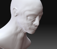
man skin texture


adding detail to the sculpt using the brush's standed, clay tubes and slash 2 i start to create skin wrinkles where movment is apparent thinking about the muscle structure underneath. getting the main structure right first is key to the success of this detailing stage. next time i think more reference would be help full. i found i had the eyes too far out and the lips looked more like sausages where infarct they are angled into the face the muscle around slopes out each stage its best to make as real as possible before moving to the next division level. the small details like skin pours i mad my own brush using photoshop. making my own alpha brush could give me great control over the textures of the skin and other materials. it works by creating depth were the white pixles are and zbrush maps it onto the 3-d polygons extremely well. the skin pours were all created with this one alpha by rotating and varying the size and depth i was able to get a satisfactory variation. its amazing how much more realistic the face looks after adding the pours in.
The skin texture its self i find very interesting and will come back to Zbrush in part 3 to show the things i am studying and possibly go below the skin and try and create muscle and bone. At this stage i also started to play around with the shadows and lighting. to create a more real feel. genrally shadows outside are longer and inside shorter. the final render i want to have the face coming out of the dark so i also started adjusting the fog level.


Saturday, 26 February 2011

starting new head


 started on another head going to try and make it photo realistic like (insert research) instead of making it from Zspheres  its molded from a single sphere using the move and standard tool along with masking and smoothing i was able to make the base shape. its already looking better than my early attempt's so lets see how it goes. Hopefully it will be a good piece to finish part to and lead me onto part three where i plan to study skin. i also plan to use the flattened 360 of ed to render the skin fingers crossed it works i will be using "zbrush essentials" magazine and "anatomy for the artist" book for guidance and reference.

Friday, 25 February 2011

Mark Quinn

the photos of the skin are much like the works No Visible Means of Escape by mark Quinn. and in doing the inverted 360 photos the title now makes sense to me. no esquape meaning the skin encases the body you can no get out of your own body and i spose this is quinn "looking for a way out." With my photos if i were to do an entire body it would fill the viewing space and because its flate and the is no way to look around it ... i imagine it feeling quite entrapping almost like you the viewer could be wrapped around.
the way Quinn has displayed this peace gives us a reminder of mortality its hanging but with a red noose the red brings it to are attention although it does look out of place there is that pose of being hanged. then it makes you question about quinn trying shred his skin , start a new , hang the old?

flat 360

almost completed there is a few blotches and un blended parts but you get the idea. this really excites me and i think has massive potential the next step would be to do the entire figure the most challenging parts being the hands i think. i would then like to experiment with the form of the figure for example a crouched compact figure flattened will turn out different to a standing one see how the shape and forms change.there is a kind of liquid jelly feel to the image as some of the contours were not exact to the lens you can notice this in the eyes and nose. there are some difficulty that could arise if i want to capture a fixed position with view points because the lens has to be a certain distance away from the object/form to focus folds and joints over 90degrees do become a problem.

the piece its self is quite wackiy and head to get your head round at first (well i found it hard when blending it ) and there will be some destortion to the size of the form which will require planning and my decision to what parts increase in size and what part decrease.
 something I'm worried about these works is  that they will look like animal skin rugs but humans that putting a message of mortality and death is something i want to avoid or at least in this way it just seems too cleché.


Thursday, 24 February 2011

flat 360 photos

in part one i had an idea to make an inverted 360 view of an object.using a total of 90 photos (view points) of eds head and left arm i hope to blend together to create a flat image of the surface. i think this work could be the bases to what i do in part 3 i'm really excited about seeing what i can get of it and the amount of detail to one image is potentially huge. i used the same setings on the camera with the flash on in an attempt to try and get everything in the same light so i can cancel out all shadows i could try one with an intense side light to see how the shadow moves across the surface and would essentially be bending the light flat. this piece is all about opening up peoples eyes and trying to change there perspective. there is a very scientific documenting feel about the entire process and cant wait to see if it works and do some more ...maybe with entire figures.


Sunday, 20 February 2011

triangle clock


 i have found a method to create the base for my "triangle clock" in the processing ebook. its simple really take the standard code for an analog clock and draw 3 more lines the are fixed to the end points. its quite pleasing just being a simple shape that clicks into seconds, minuets and hours. the next step will be to add the digits either beside the circles or inside and even the date in the middle one. The animation is very clicky i might try creating every time with Milli seconds so the animation appears smooth.
this clock to make in real life would need some elastic because of the changing shape an i think it would work better just as a triangle with no center point  like the image .


Friday, 18 February 2011

triangle clock idea

while in the bow house gallery i came up with the idea of creating a digital triangular/tetrahedron clock here are some drawings of what i want the clock to look like.


brother falling series


3 a3 drawings of my brother Arthur falling (bouncing on the trampoline) really enjoyed "just" drawing these again like the falling drawings before looking at the form and shape of the figure and extenuating it out into a white void of space to create the illusion of depth. the bottom two i have extended out a circle to create balence


I've also tried to animate the drawings in after effects using the pin tool creating fixed points and points the bend trying to create a slow motion falling movement ... but I'm not to keen and i think it takes away from the drawings as it doesn't look natural with the shadows staying the same.

Friday, 4 February 2011

falling project

I've decided to start a project on falling its something i've done before but i feel I'm a rut just doing triangles so I'm going to ease my self out of it by doing some drawings of falling and looking at the form i can create from the figures. i want to look at falling as a continues action falling is something usually you never have time to feel comfortable with there is always a sense of fear instinct in us that makes us panic and know that the ground is coming.   
the top image is my initial idea taking an element and attaching a humans action I'm thinking it could be a sport product advert or something along those lines. drawn from images on google.The bottom image i was interested in just the outline the simple form so it can be echoed by the simple triangular labels almost that com out from them the labels to me really helped the illusion of depth to the drawing and gave it structure.

Wednesday, 2 February 2011

walk outing


Walk to the quarry realized how much I missed going on adventures and taking photos documenting what’s around me this picture of the nail I think is my favorite and says the most its made from 3 photos merged together 2 of them being out of focused. The area out of focus plays against the Sharpe piercing nail. And the drop adds a purity to something very violent.