
Tuesday, 19 April 2011
It's good to print stuff out

Tuesday, 12 April 2011
falling and lines
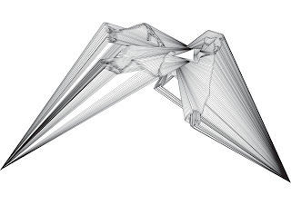
constructing the lines it was obvios i needed to try and exaggerate that pulling form that gives the figure so much movement. so attaching the lines the the points either side was the first thing to do. but unlike the other drawings i felt there wasn't a right angle for them to be. it most suited the upward facing (bottom) image dew to falling the lines are catching the figure stopping it from being able to fall but overall i don't think adding these lines to this image gives it any more maybe on this occasion simple is better.

Sunday, 10 April 2011
falling person

the finger print person in my sketch book was the main influence to keep myself from going over and drawing in the sleeve for the arm. the lack of form creates this wing because that is what the structure allows for. i think this is a great metaphor for finding freedom within constriction by showing your self less you gain less attachments less restrictions.
i chose t put the source triangle in the center of the torso trying to cover the lungs and heart of the figure because i think that's the source of are being (other than the head of course) and there for to place the source triangle where every thing branches out from seemed logical and i think it works quite well. something that i didn't really expect to happen was the the closeness that was created around it almost sucking the rest of the figure in rather than forcing it out. it works quite well though separates it from reality and creates an obvious restricting factor. at the same time this squeezing exaggerates the rest of the form outwards so there is a balence happening between the structure and the figure. this unintentionally represents possibly the balence we strive to find in life between friends and work or structure and freedom.
I chose the figure to be falling because there is that sense of nothing when you fall as a skater i do it a lot and there is a crazy feeling where you have no control over whats going on. everything is concentrated on the landing (on my board or face) nothing else matters when your falling because hitting the ground in the right way is essential. because of this powerful sensation i am always inclined to involve it my work although most people probably wont have the same perception its my own expression of escape and escaping is freedom
Tuesday, 5 April 2011
source triangle hand + lines
 the final composition I've used the same line structure as the cell triangles because of there success of creating that feeling of constriction but there angle can at the same time become pushed into a sense of freedom for the triangle form.
I've also angled the form so the source triangle is level this makes it feel as a base structure I guess because of its boldness it has the most presence. I have began to question what my art work is because the more digital get the more i seem to be going into graphic design and this is a perfect case. the center triangle could easily hold a logo and it could become a website or t-shirt design. I've always been close to the design side of art dew to my use of the computer but i don't think I'm fully graphic design i should try and find out what the difference is and what I see my self as.
Monday, 4 April 2011
source triangle hand
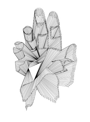
complete, the hand is now entirely made out of triangles from one source triangle. the first thing i notice about this pattern is the flowing curved lines have been transformed in to restricted form and because of this there is a strong sensation of explosive movement. the lines act like blur lines seen in cartoons all coming from the source triangle. this feel of explosive movement makes it feel held back or stored like it could release at any moment and fits quite nicely with my project idea.
the negative and positive space created by the triangles swap to create the shape of the hand i think this works best in the fingers i chose to keep this minimal factor trying to keep it to a minimum to be noticed as a hand but keeping it realistic at the same time.
Sunday, 3 April 2011
making the triangle hand

i think its working WOO! taking my drawing method to the computer has not decrease the time it takes but increased the playability with the lines and colour. structuring the hand is much easier as well but I am not sure if I'm loosing that important flow. i think it will be possible to make this from one source triangle without making the triangles to thin which will keep with the restrictions i have layed out to try to be creative in.
the form of the triangles is wrapping the hand in a very visually exciting way i think there is a sort of gloopy feel that the fingers are trying to stretch away and become alive. pushing the boundrys and progressing something we do as humans invent and go to new limits i think this hand form is starting to capture that in a very minimal form. using a hand the triangles are more about the structure rather than expressive this means the concept becomes more on the form i'm creating than the structure its built with? and i'm not sure that's what i want but i will have to continue and see what comes out.
Saturday, 2 April 2011
triangle hand 1

 there is a major fault in my process of drawing this hand and it lies in the layering. the layered structure of the triangles is one of the most important things to create and illusion of depth and because a hand is so recognizable this is crucial to get right. I've done another drawing(below) of the layered structure of the triangle pattern as you can see the thumb is the 3-4th layer down when it should be the top or bottom. but what exaggerates this is that the little figure is the top layer making all the other fingers underneath this inverts the curve of the structure of a real hand and there fore feels unnatural.
the next move i think would be start to draw it on the computer using adobe illustrator i would be able to adjust the layering of large groups of triangles pretty easily and i would build the structure by copy and pasting the same source triangle and stretching it out over a hand image so i can get the form tighter and more specific.
as you can see ive started to add a black fill into the source triangle and some others to see how it affects the form and weather it sets it back or in front. it definitely separates it from the form even when there is a lot of them they seem apart from the pattern if i were to add colour (red) i would have to be cleverly placed and possible very limited. as well as colour i could fill it with cut up photos of the hand it self to make it more recognizable and also the shadow would increase the depth. but it would loose the graphic slick feel that i am currently creating and enjoying. i could try to add just one triangle of hand skin to give it a hint of what it is.
Friday, 1 April 2011
Rebbeca Ward (research)

seventeen is sharp
electrical tape, vinyl adhesive
06.19.09
kansas city, mo
charolotte street foundation/urban culture project
rebbeca ward intreasts me becuase of the way she makes and descibes her work she says it is process driven art by just reacting with the surroundings. we are taught to come up with a concept an idea behind are work. without that renforcement i thought it would be diffuclt to gain recognition. to me this is exciting to be able to just create from a matieral she loves (electrical tape) and not have a mojor concept over the top its just pure creatrivness. there is deffently a feeling of escape in her work i can tell she loves the repertition of the proccess and i do the same with my drawins it is rewarding to see somthing unpland bar a formula take shape before your eyes kind of like a gustalt drawing but at a controled level. it makes me wonder if i were to do the same proccess on defferent days would it turn out different dew to my feelings somthing that seems so cold and blunt (lines) i think could be quite expressive for example close together is a more clostrifobic and frustrated feeling where as spaced out connots a relaxed senes a contentness where there doesnt need to be an overpowering structure.
ward has produced her work in many different enviroments and each time i think she adds a little more to that space by reeating to it she creates reactive passive landscapes that are subject to the walls around them. i should possibly try and do this within my patterns and react to the things next to it.
Tuesday, 29 March 2011
Monday, 28 March 2011
tri cell 2


this drawing as a smaller angle to the previous , still obtuse but having it less give it more of struggle to straight and the lines become dominant the angle also points to the right of the page, pointing to the future. In TV we often see if something is progressing it tends to travel in the right direction so for battle scenes the baddies could be moving to the left were the good guys will be moving to the right. using this in my drawing the lines pull the form back as it try's to travel right helps to tap in to that subconscious rule in are brains that it is good and bad.
there is a life like quality to the form like a cellular structure. i can imagine it being in an animated pool or under water or even a design for an under water robot.
(talk about the game flow)
the next move is to try and create recognizable forms out of the triangles. i will do this by either following the contours and shading of the objects or by using its outline but i must try and mimic the same sort of depth by layering the triangles correctly. it will be interesting to see whether it looses or gains any quality with a structure made.
Sunday, 27 March 2011
tri cell 1


Thursday, 17 March 2011
finger print form 2

this is a much more successful piece at creating depth than the first fingerprint person. this time i chose to use a racing car as the subject and really took in to account the shadow and tryed to imagine a straight line flowing over the structure so the curves would create the right form. i really like the bottom image and think the subtlety of the structure built with the complex repetition of lines creates a balancing minimal beauty.
I think this would really well as a video projection of the car so the finger print shifts over a moving car as it turns and accelerates. there could be a possibility of glitching and distorting if it were to crash the braking of the form would be reflected the braking in the pattern rule and overlay the finger prints.

like the negative space hand i don't like this as much as the one with form but this i think does work better than the hand one cutting the perspective line was an accident at first but it may be what makes this more exciting. there is so much movement in the structure the one bold horizontal line brakes that in a smart and precise way. i could see this as a part of a website with text / info written opposite the structure.
there is also a strong feeling of architecture in the form although started from a racing car it looks now more like a skyscraper interesting to see how the process of taking away can create new things.
finger print form 1

over all this is too flat and looks more like an outline of a person than curved depth. something i do like is how the perspective line has created a wing formation draping from the arms and wings are a symbol for freedom i could possible use this in the future.
Wednesday, 16 March 2011
getLineIn()
more pics to be added
today I'm trying to see if i can make a sound reactive piece using the program processing. after reading through the processing manual i have i found the way to go about it would be using getLineIn() code using minim sound. it works by using the built in microphone to the computer. the data is converted to the buffer size which i can change. so if i put the buffersize to 2000 the sound waves would be 0 - 2000 so i can draw an array from that and tell the computer to draw theoretically what i like using the buffersize to move twist distort the image 0 being no distortion and 2000 being max... pretty exciting :D
 this sketch to show the way the hand could move to the sound. Because sound is in waves it hopefully will be fluid rather and wont glitch. i now have to work out a way of taking the drawing from paper into code as separate layers.
today I'm trying to see if i can make a sound reactive piece using the program processing. after reading through the processing manual i have i found the way to go about it would be using getLineIn() code using minim sound. it works by using the built in microphone to the computer. the data is converted to the buffer size which i can change. so if i put the buffersize to 2000 the sound waves would be 0 - 2000 so i can draw an array from that and tell the computer to draw theoretically what i like using the buffersize to move twist distort the image 0 being no distortion and 2000 being max... pretty exciting :D

still dont like it

Tuesday, 15 March 2011
hand print day 2

experimenting with empty space. the thing i noticed most about this is it is unrecognizable where the the perspective hand print takes some to time to figure out and then you can look deeper at the detail but this seems to have no destination or object to relate to. it's empty and flat i could possibly salvage it through movement but i think the print just speaks to people that much more.
somthing i do like about this drawing is the great sense of movment created by the lines and the repetition creating a gradient like pattern by overlaying the lines.
by using my hand print i am putting my own identity in the drawing and if i was to distort it with sound i guess i would be saying how the things around me effect my identity we are all susceptible to influence its the main reason of progression if we weren't influenced by others art its self would struggle to exists i think this is why this piece has so much potential and why away the hand print is the wrong thing to do.


Monday, 14 March 2011
hand print

 like the triangle drawings its as much about the empty space as the form its self and i feel its worked best were dew to the hand not being flat there is gaps in the print where you can see inside the layers. maybe tomorrow a can experiment with the space between the print more.
this i feel would be a good thing to start with to make a music reactive piece and as the sound is made the individual finger print layers can be pushed back and forth (possibly with a bounce as well) to create the depth of sound effect. with the potential of adding more vanishing points and layering the lines i could begin to separate sections into volume and pitches a possibility.
Saturday, 12 March 2011
yago hortal (research)

this expressive enery is somthing im tring to resemble in the fluid motion of my triangles now im not going to get as expressive as this with straight nonoverlapping lines but i think i am achiving mopre than i expected.
like me yago hortal has also left the white viod to contain his explosive seed of creativity. this is highly effective in creating that sense of scale and pertential if the piece was to fill the entire page it would loose that storage of energy becuse it would have been spent.
Friday, 11 March 2011
Tri form

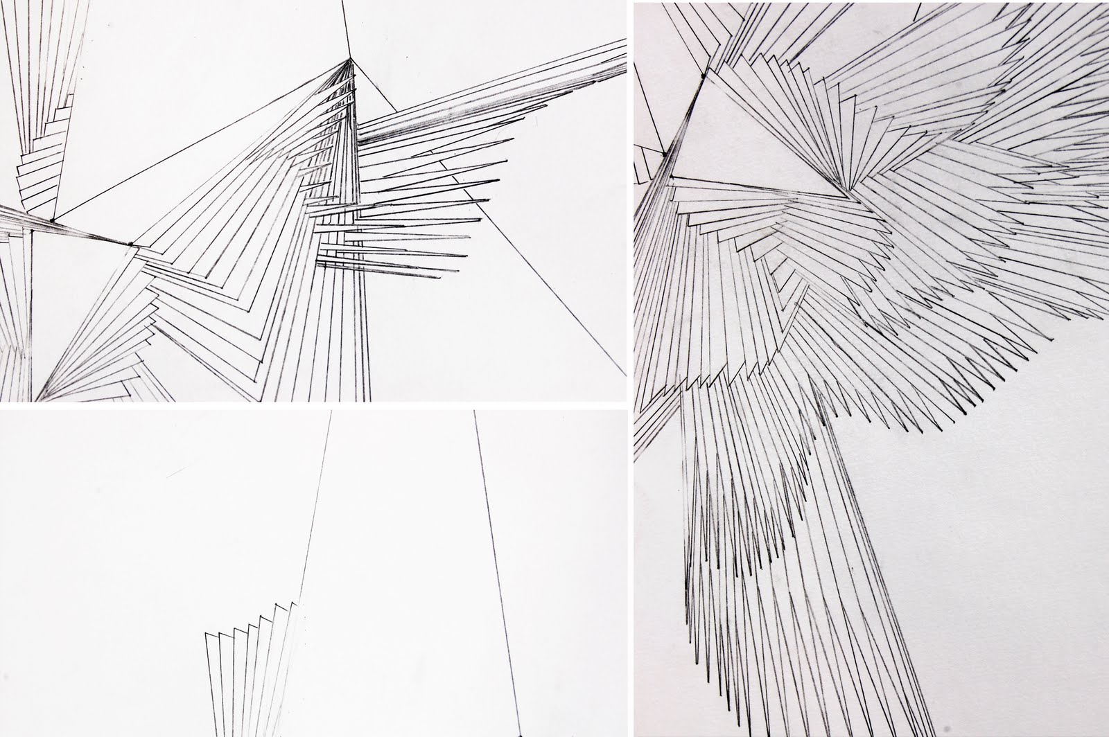
following a similar structure but having the freedom to create other triangle sources. by drawing this one i realized how constricting the other one looks. this drawing is more about braking free as the triangles grow out from the main corner structure where the one before was about containing. the is still that void of space but now it looks for expansion. and making the angle of the main structure obtuse has released tension in the drawing. t me there is also a strong feeling of floating. unlike the other one it is not attached to the edge of the image the bulk of the triangles are at the top of the image like a balloon structure. the curved flowing lines created by the repetition of the triangles also resembles something like seaweed floating in the ocean.
the next move would be to collaborate the 2 triangle drawings and see what sort of feeling is created from the form. my aim is to create a freedom within a constricting structure so i think keeping this flowing form has more freedom than a spring shape and will experiment with different ways of creating it in my sketch book.
Thursday, 10 March 2011
hand and head glitch

please click to see bigger.

to take this piece further i would love to animate a figure warping in and out of this form to sound or something along those lines. continue ....
Subscribe to:
Posts (Atom)